Papa John's Murals
- Gracie Dahl

- Jun 3, 2022
- 4 min read
Updated: Sep 16, 2023
I thought I’d make my first blog post about my Papa John’s murals from earlier this year! It was a really dreamy project, with an amazing team who encouraged and supported me with the daunting task of creating large scale artwork for such an iconic brand. I couldn’t be more thrilled with the outcome!
Let's tuck in, I hope you're hungry...
THE BRIEF
The Papa John’s Tower Bridge store had recently been refurbished to create a new restaurant space, which left a rather large and prominent blank wall. I was asked to design something to cover it, to engage to both those picking up takeaway orders, and those sat for a longer time at the restaurant seating. The brief was to create a landmark artwork, to feature in photos and selfies, and be an attraction for visitors.
I’ll begin with the first site visit, back in November last year. I met with the project leader, Julianne, chatted through what we thought would work best, took photos from different angles and checked measurements. It became clear to me that a big part of the design should be to draw people in from the street, as the sides of the wall were visible through the main window and doors.


THE Research
I like to begin most new projects with visual research/ mood boarding; it’s something to have up on my screen as I thumbnail in my notebook, informing initial ideas. It’s normally during this initial research I stumble across a colour palette and format I like- you can see below I was thinking a lot about layout, both grids and looser lines, and rich, pizza-y colours.

(This is kind of my favourite stage - I really enjoy the looseness of coming up with these ideas, not yet knowing what the illustrations will turn out to be!)


very rough initial thumbnails!
THE DEVELOPMENT
Here’s some progress of sketches worked up digitally, in Procreate. These became three wall designs. I mocked these up regularly against the wall photos I’d taken, to check views from the street. The design for above the counter would come later, as a remix of whichever final design was chosen.


1 - enormous pizza-ified tower bridge, with munching visitors (all to perfect scale, clearly)
2 - grid-structured design designed to neatly crop into people’s pictures
3 - looser map-style, incorporating toppings like ham and pepperoni, alongside traffic and pedestrians, with directional signage on outer walls


We then had a meeting to discuss these initial designs. We decided on keeping the cheese-covered landmarks of design 1, but applying them to the design 3, which felt busier/ like there was more to spot for those looking at it for a while- like a giant Where’s Wally was the idea!
THE WORK
Then came the mammoth task of constructing such an enormous file - it was quite the mathematical task! I would have liked to work up some of the components by hand, but my scanner was really not up to the task, so they all came together digitally. I drew each element separately on Procreate (using a mixture of standard pencil brushes and Vivibrush 1), then added them in one by one to the gigantic photoshop file, which was at 100% scale to the wall, on top of the rough plan I’d outlined. My laptop whirred so loudly it nearly deafened next door.


Now a word on the illustration's actual components! You can see in my initial design that I incorporated mainly very local buildings, on Tower Bridge Road, and not really any further afield. To appeal to tourists as well as locals, we turned these into more standard landmarks, such as the London Eye, Tate Modern, and Parliament, as well as boosting the number of visible toppings to include basil, mushrooms, and pizza-trees. I also drew a bunch of people (one of whom may or may not look quite a lot like myself!) and some delivery motorbikes. It was a really fun puzzle slotting them all together.


These are the mockups from after this stage. I’ll streamline the next section slightly, as there was a fair bit of fiddling around which wouldn’t make for super interesting reading! It mainly involved tweaking colours and adding in more store branding, making cars into black cabs, etc. It was at this point I constructed the above-counter mural strip, featuring a few different components atop a ham-coloured Thames.


(At this point I want to thank the wonderful Matthew Robert Edwards for his invaluable advice about enormous file handling!)
Once the final design had been approved by everyone necessary, it was sent off to the printers. The designs were digitally printed onto enormous vinyl stickers, durable against people brushing past.
Then they were up!!!
THE outcomes


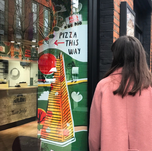


I felt a bit emotional seeing the designs in the flesh for the first time, like a huge nerd! A massive thank you to the Papa John’s team for being so enthusiastic and lovely about the outcomes. It's very surreal seeing people visit to take pictures with them! It feels quite a milestone to have work permanently installed in such a public place; I feel so grateful and proud of what we’ve come up with!
You can visit the murals at Papa John’s Tower Bridge, 168a Tower Bridge Rd, London SE1 3LS. Please tag me @graciedahl in any pictures!
Unless otherwise stated, all images are (c) Gracie Dahl. Please do not re-share or reuse without permission.


The final designs turned out amazing! Thank you for going into your process with such detail, as an illustration student going into industry this was incredibly insightful!